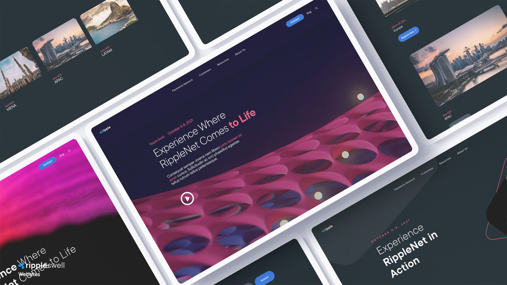
Ripple Design System
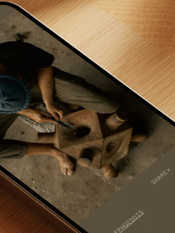
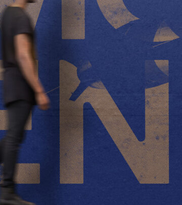
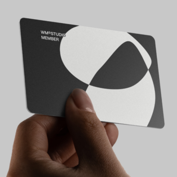
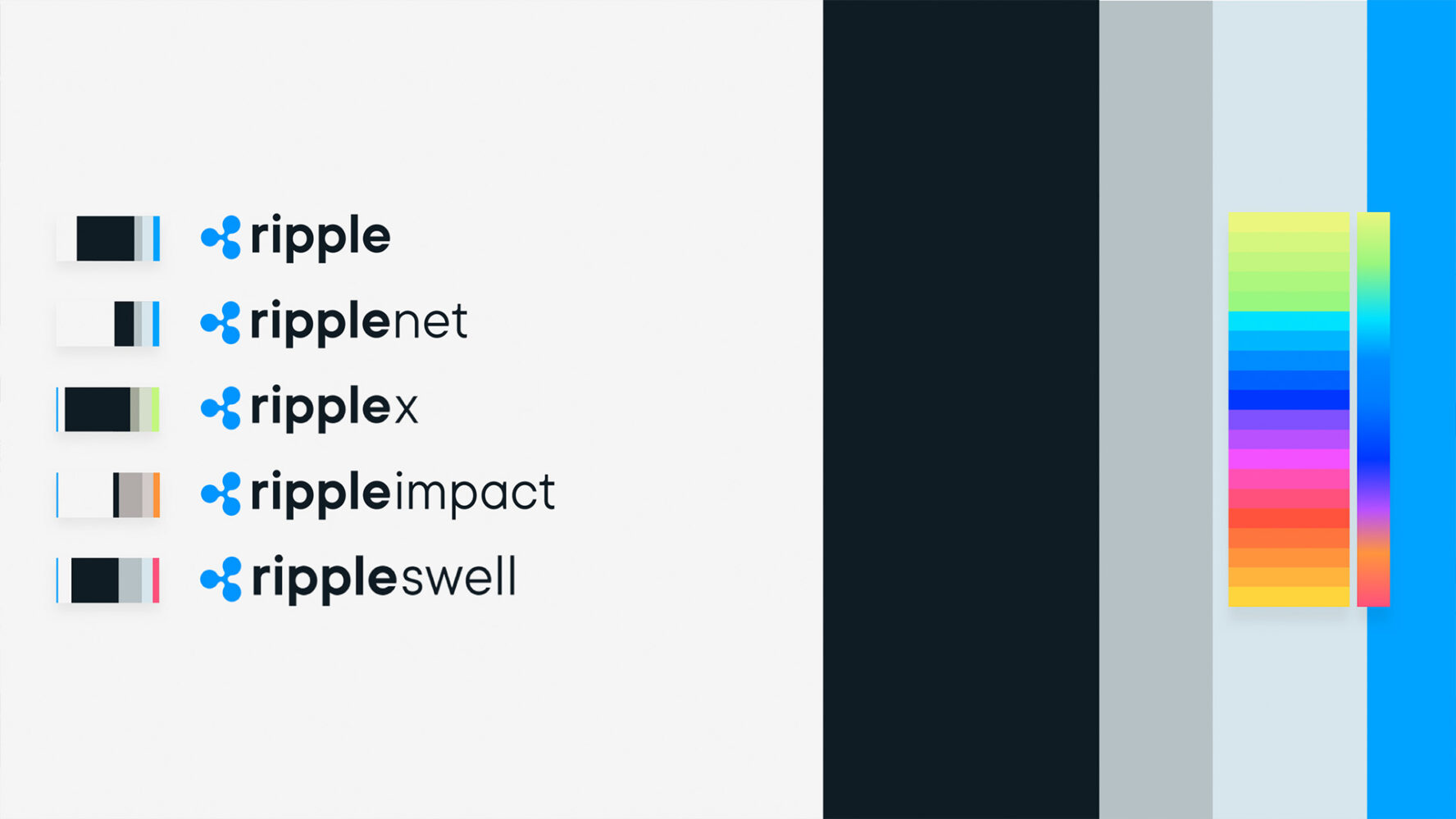
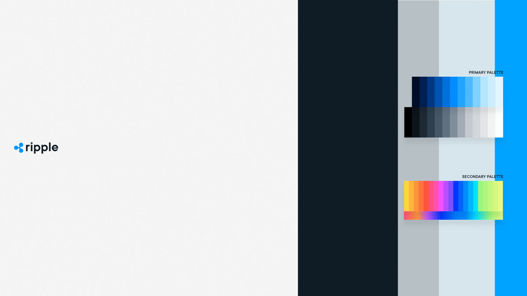
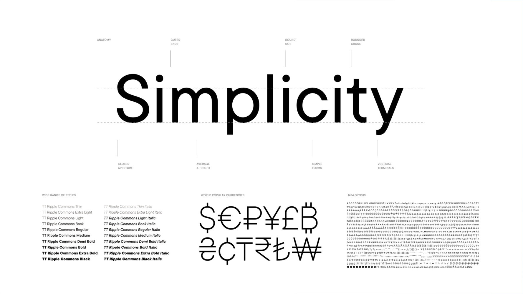
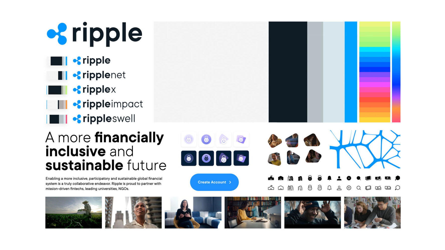
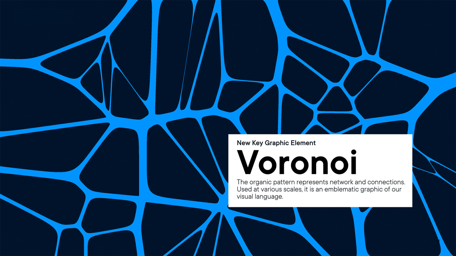
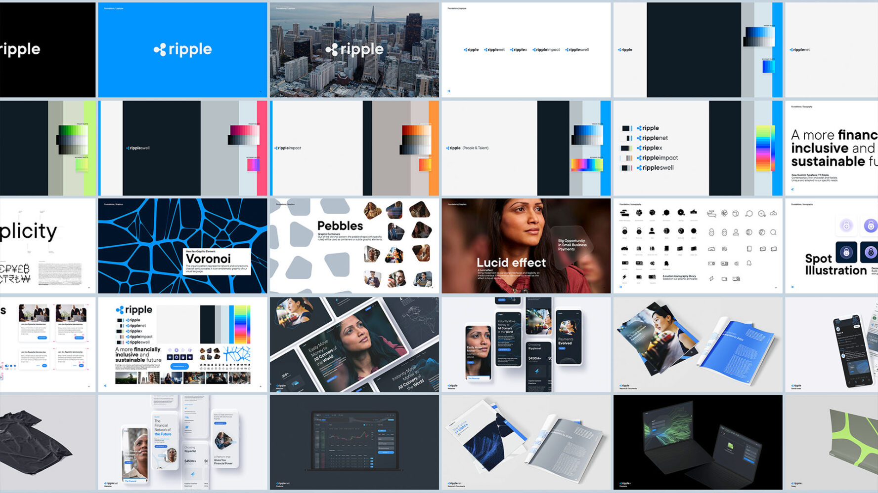
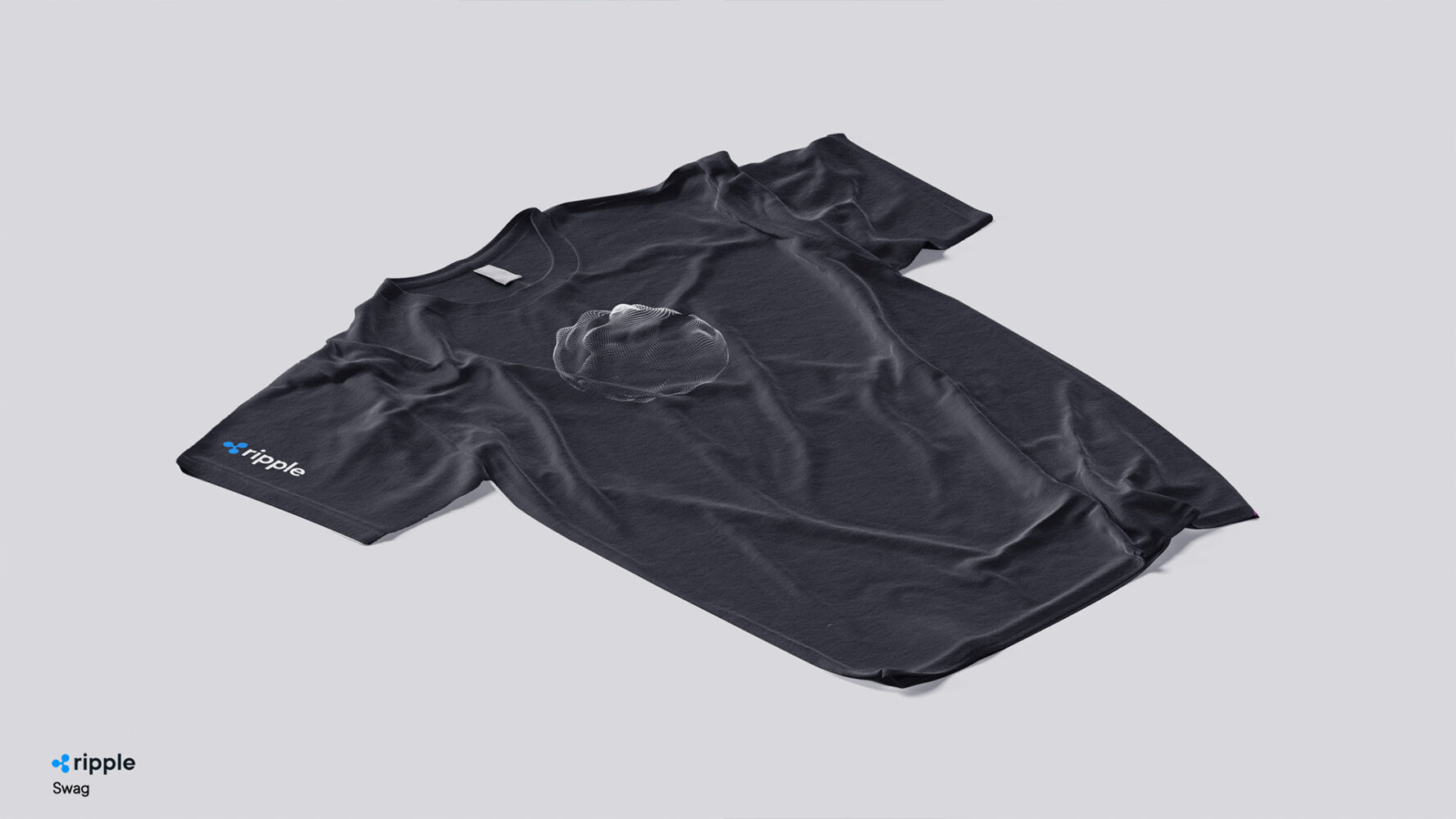
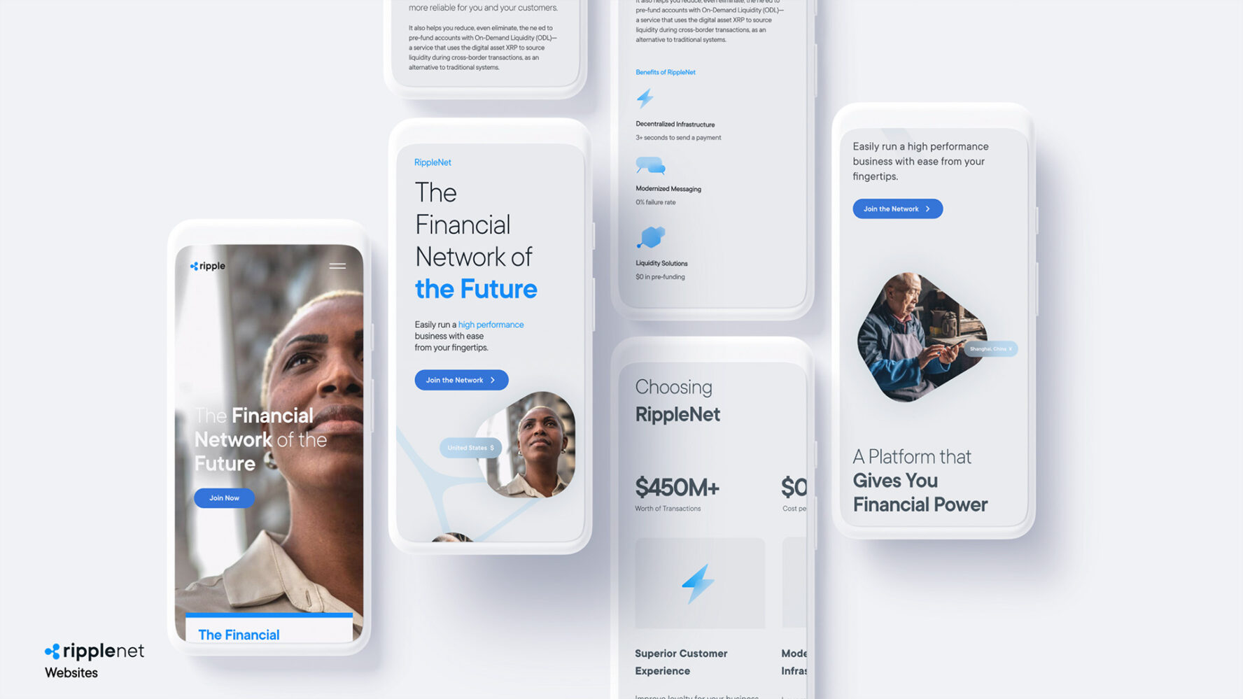
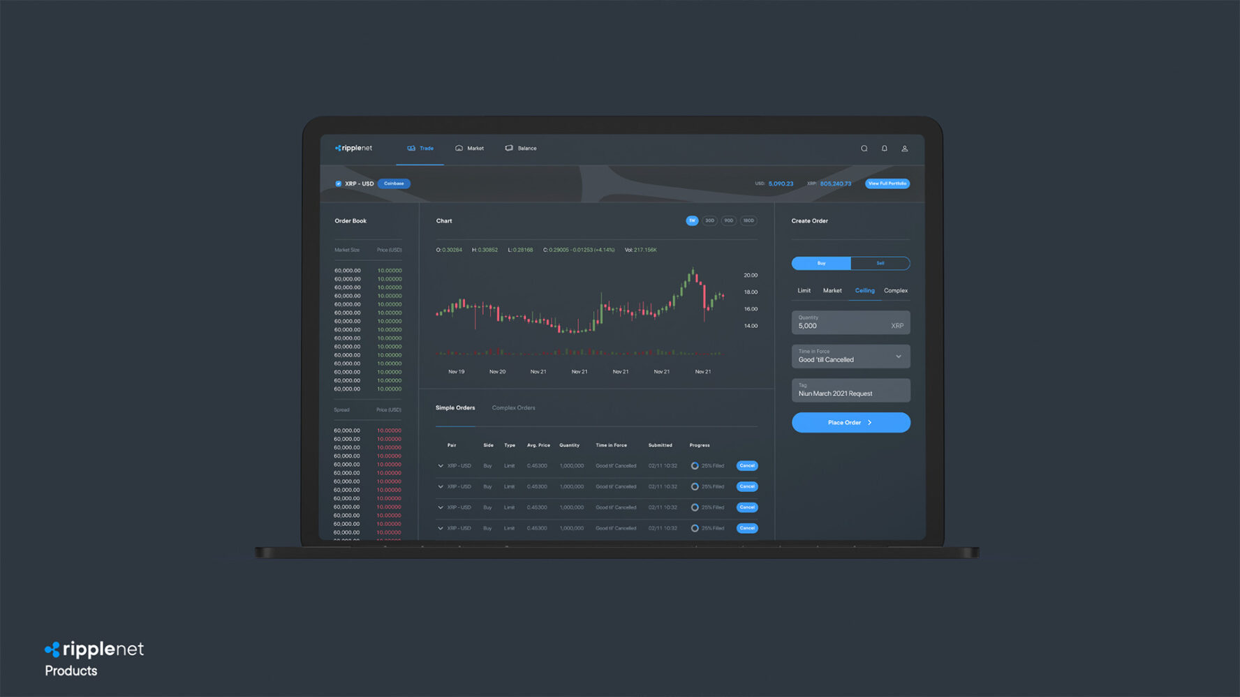
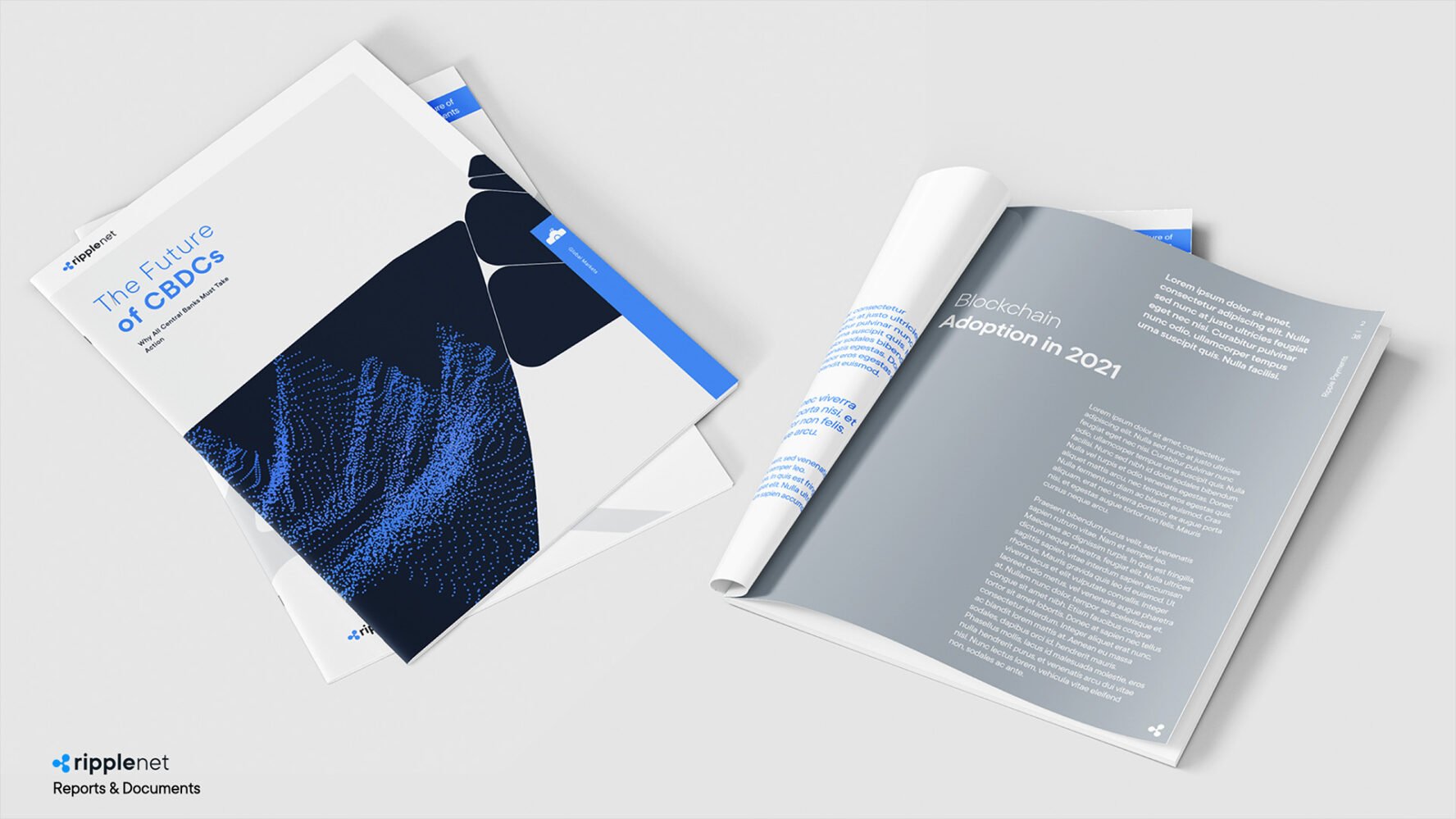
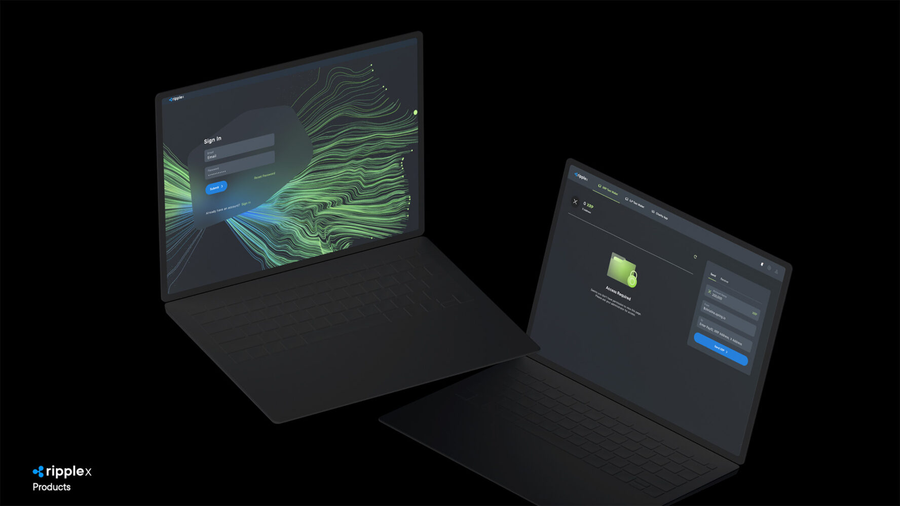
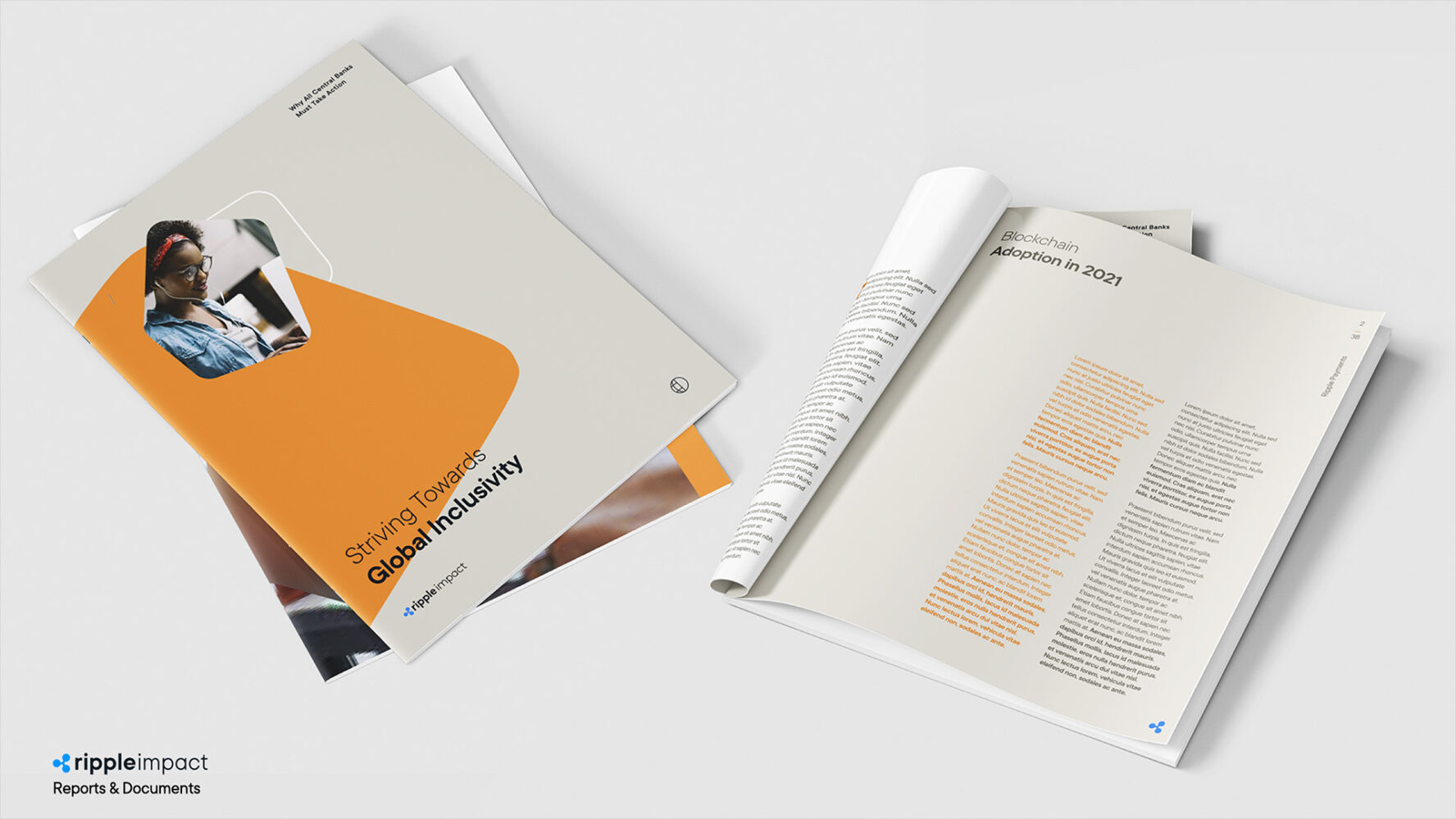
With an updated internal strategy as foundations, we were tasked by the crypto giant Ripple with the development of the new brand design system. Our role was to lead and oversee the talented internal design team at Ripple, through a year-long process. While the brand had good foundations, the light branding was built when the startup took off and with the massive and rapid growth of the company, a solid design system became a necessity. The first phase consisted of exploring high level concepts that illustrate the strategy and give a visual translation of the brand character. We entered the second phase by developing the core creative idea into a visual language: Each foundation (logo, colors, typefaces, animation, motion, medias, etc) should directly speak to the core creative idea. The main objectif being that these foundations could live together harmoniously and with balance, despite the necessary modularity of the design system. We worked with TypeType Foundry to develop TT Ripple, a unique typeface based on TT Commons with subtle tweaks so that our typefaces matches with our graphic language and design principles. Regarding the graphic environment, we wanted to have an endless library of abstract imagery. We worked with SPAN Design Studio to create a custom graphic generator, enabling anyone from the Ripple team to create unique graphics with a Ripple visual signature. The last phase was to design rules and guidelines around these foundations. This phase requires a lot of in-situ stress tests; a lot of back and forth and adjustments so the global system is as solid as it is flexible for any designer to use: brand.ripple.com.
Ripple
2021 – 2022
