


×
Sterling Strand
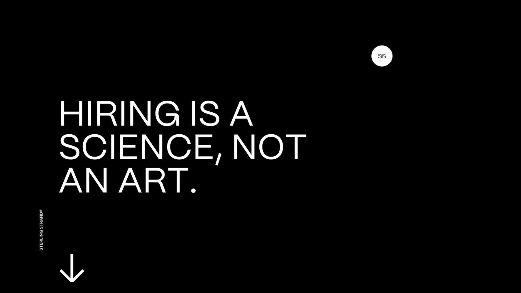
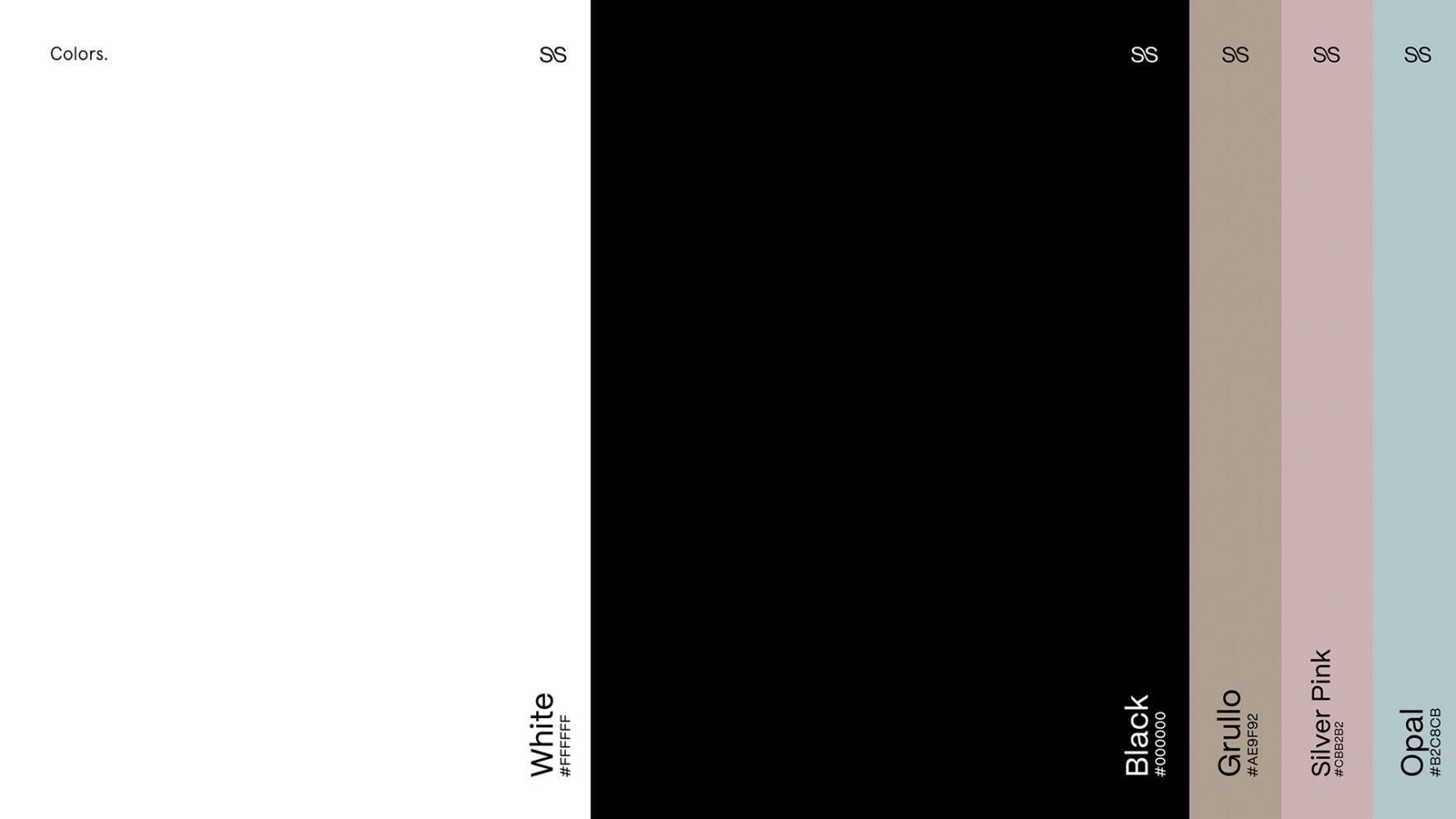
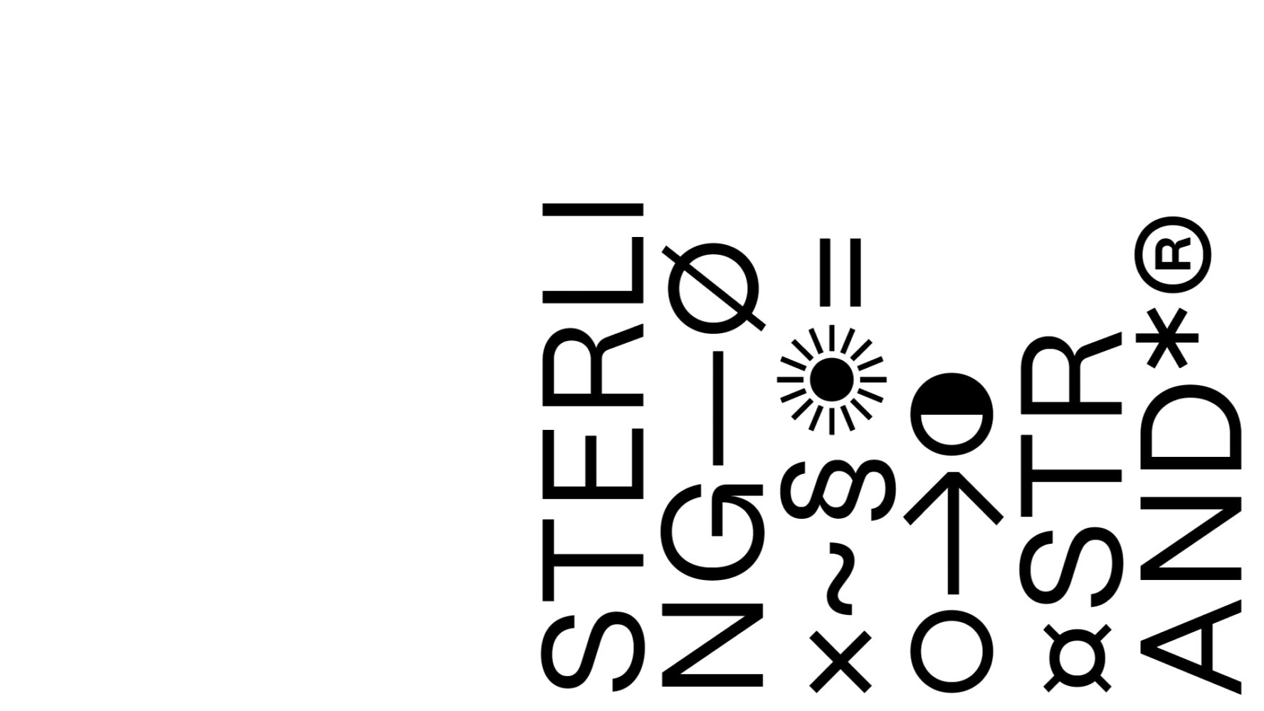
The people behind Sterling Strand are minimalism lovers. They wanted a website reflecting their very pragmatic approach to recruitment, based on no-BS, datas a proofs. We designed a minimal and rigid system, free of anything superfluous. A simple but rich typeface treatment and a layout with the content ‘dancing’ and placed organically on a structured grid. In collaboration with Maxime Bérard, we proposed a balance between simplistic graphic but with subtle and animations and interactions.
Wookmama
2022
1
2
3
4
5
6
7
8
9
10
— 10


