×
Wookmama Identity
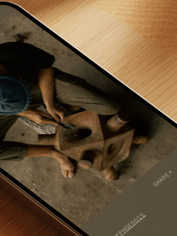
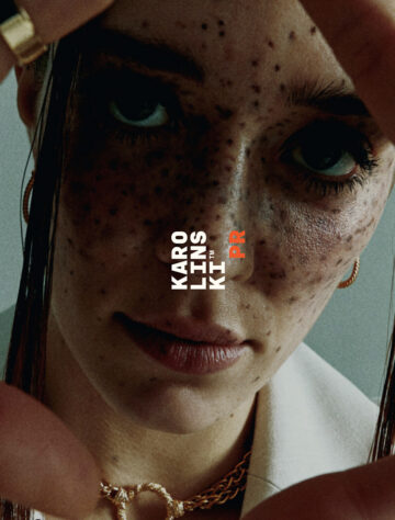
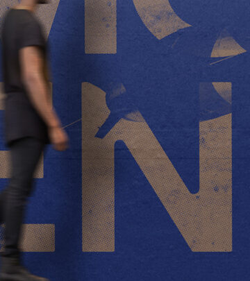
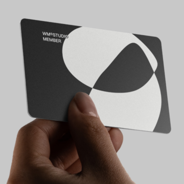
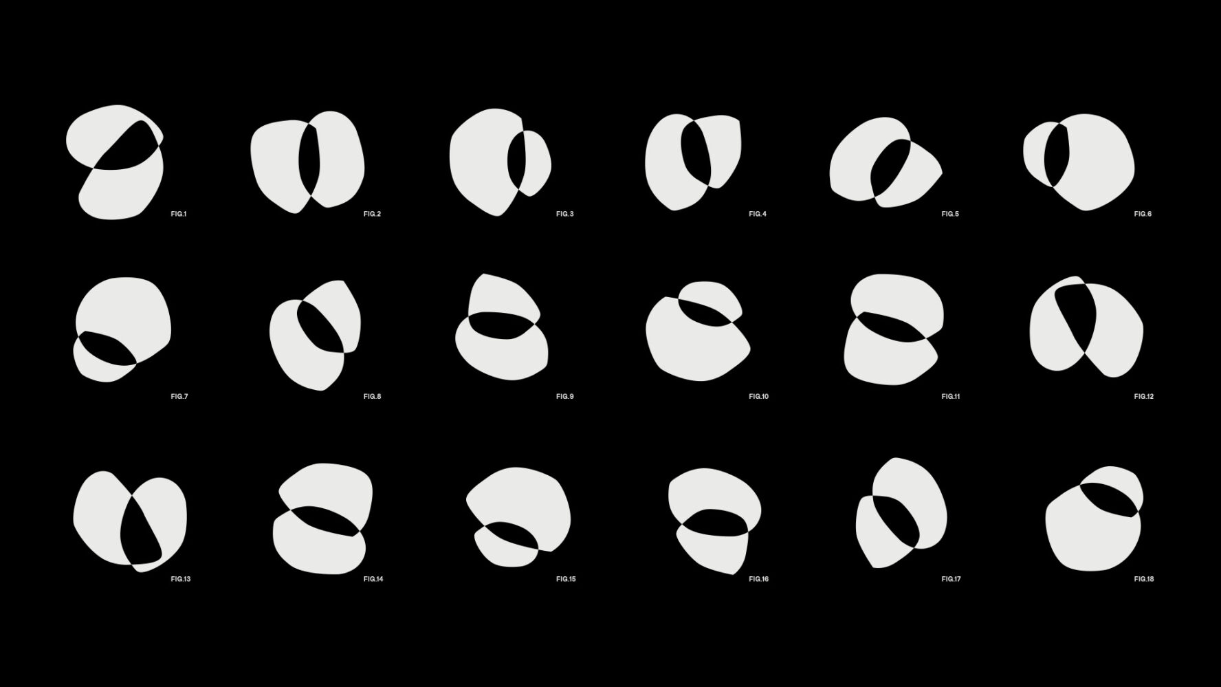
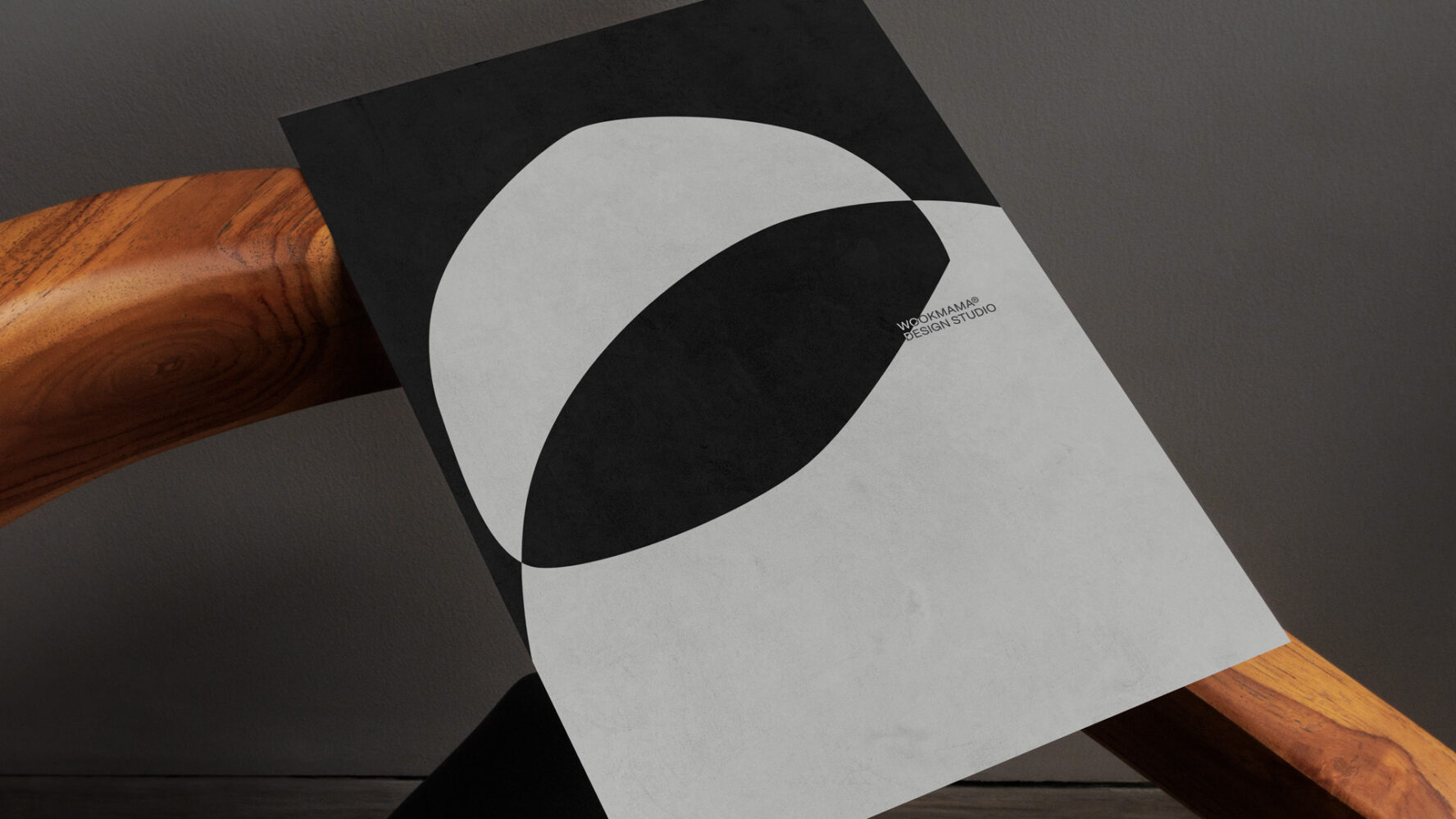
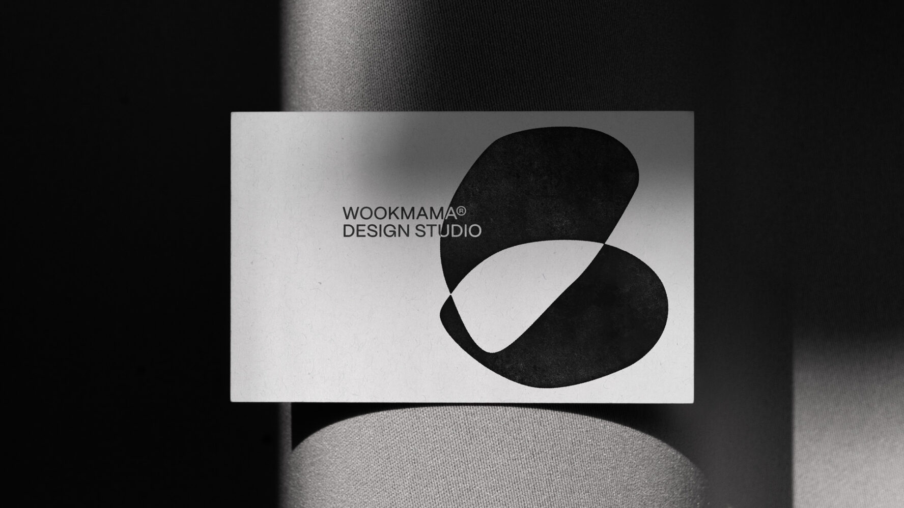
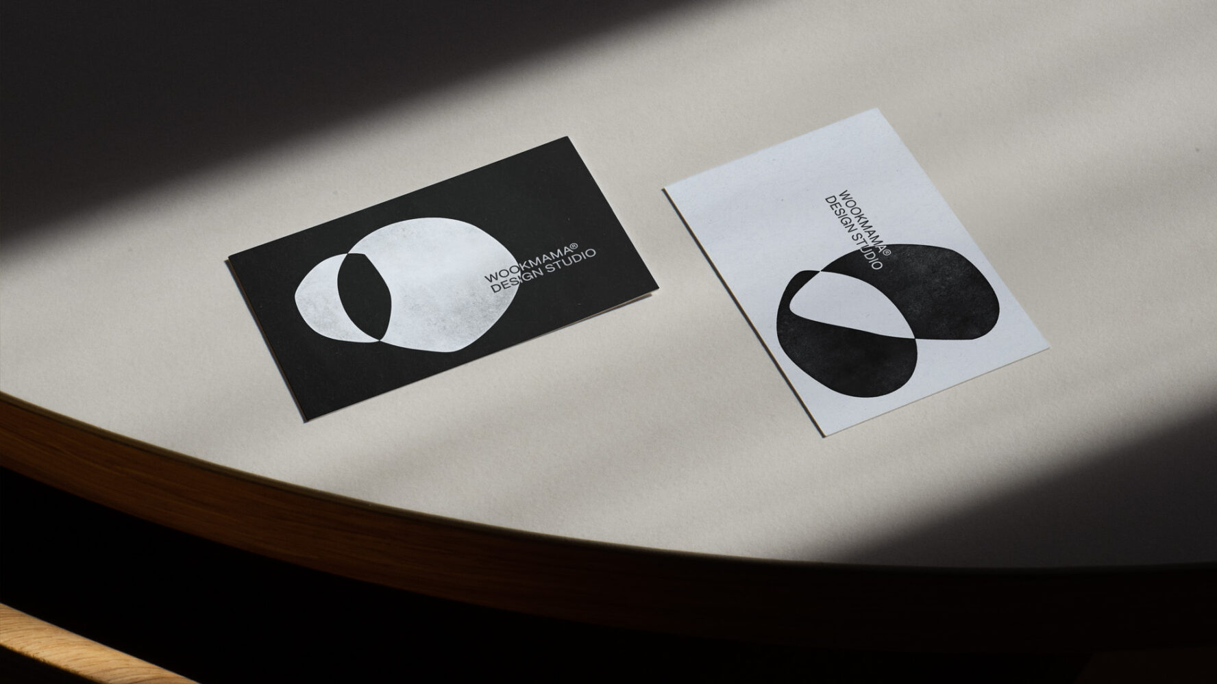
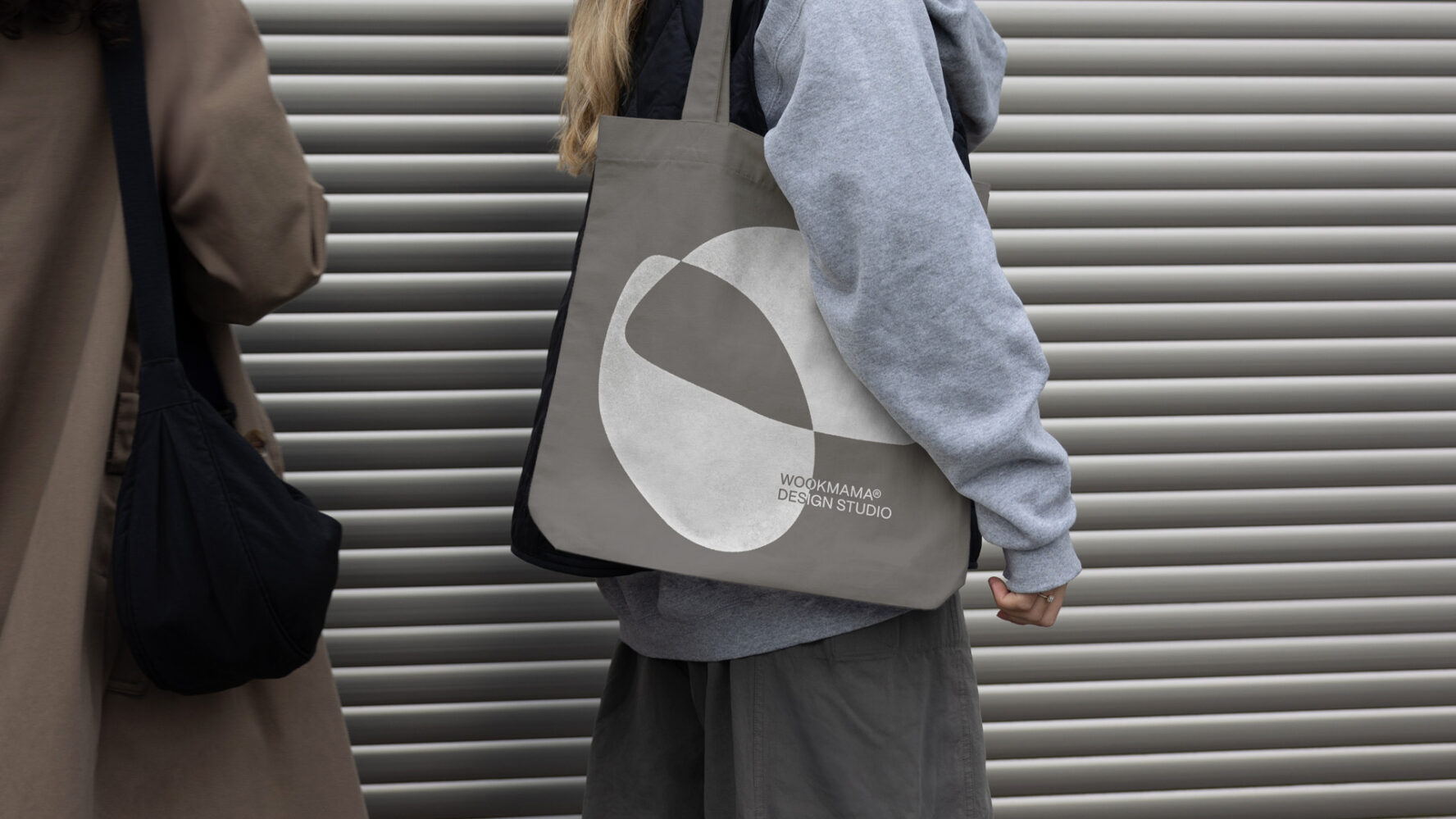
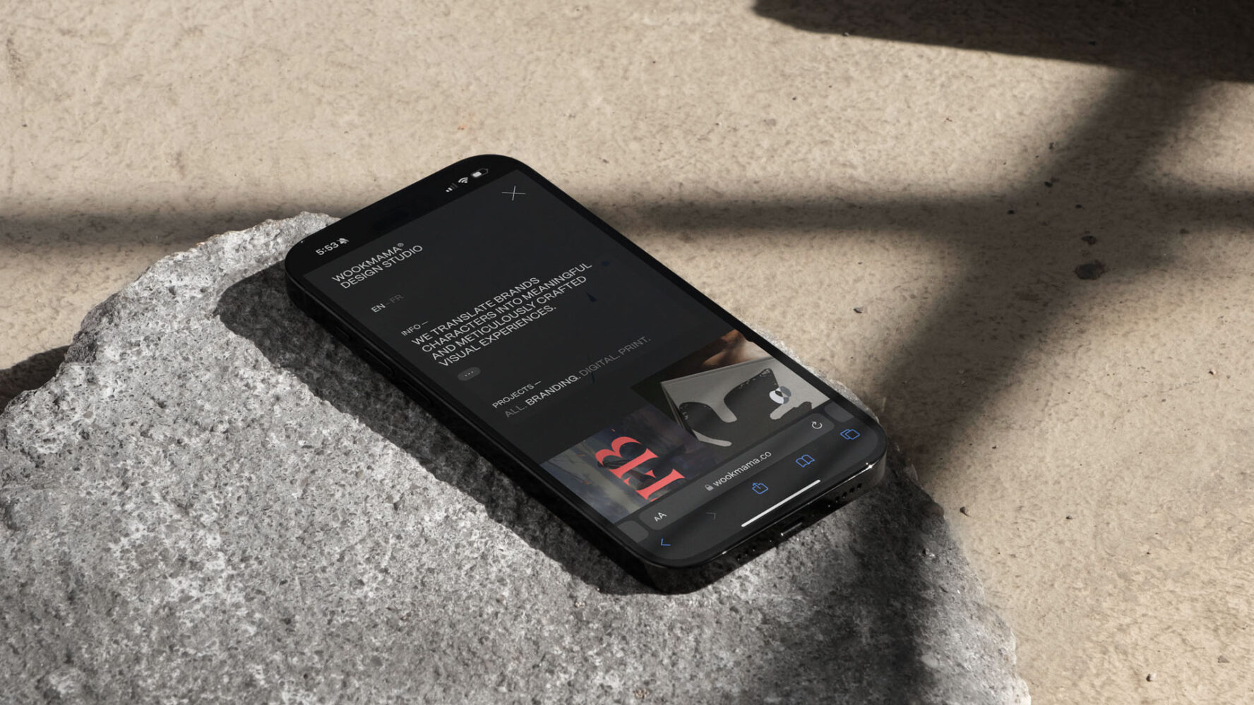
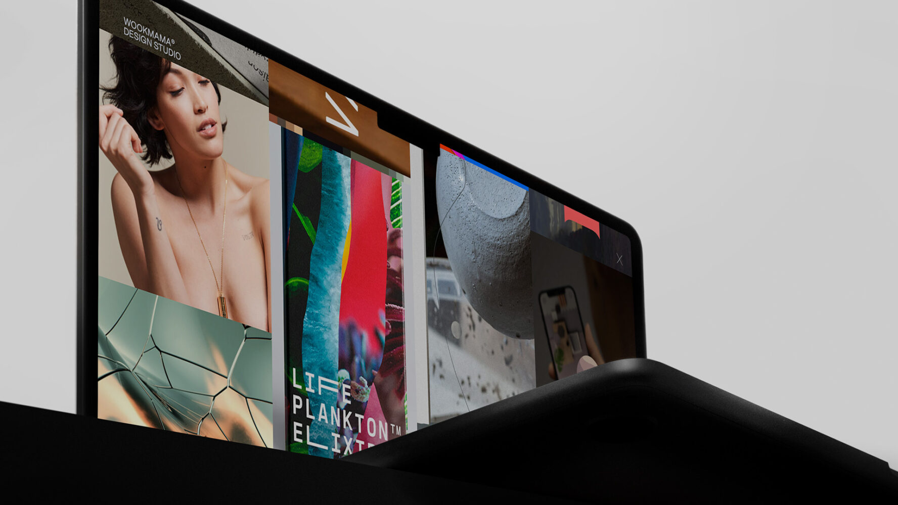
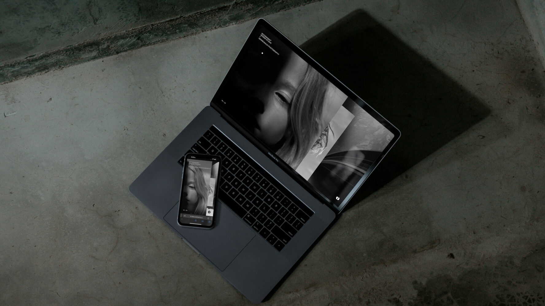
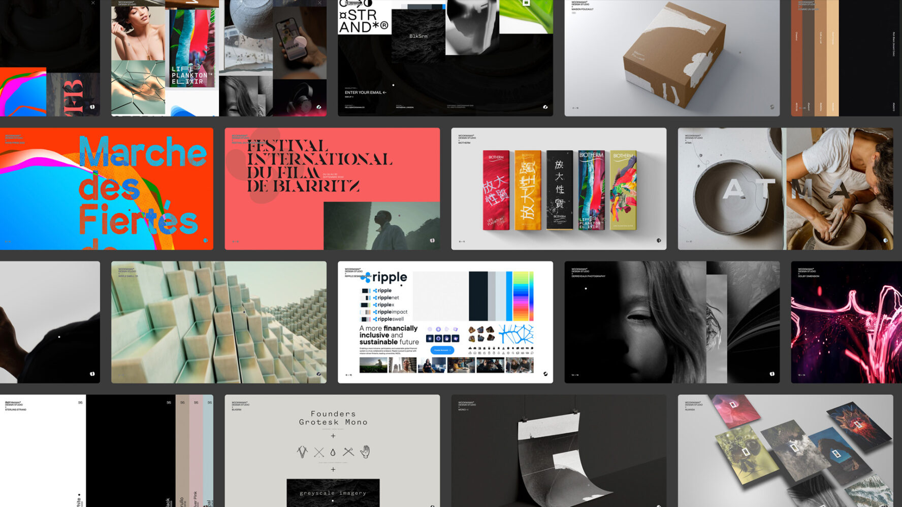
This year (’24) marks the fifth year of the design studio. It started as a freelancer activity, now growing into a studio / collective with many interesting projects and clients in France and in the USA. Those were valid reasons to offer Wookmama a proper visual identity and a brand new website. We chose a black and white palette to leave space to our clients projects. An empty canvas for our new typeface (Mori from Pangram Pangram) with a minimalistic layout approach and a modular logotype based on the two Os / two eyes (Look Mama!), reflecting our capabilities to stretch and adapt.
Wookmama
2024
1
2
3
4
5
6
7
8
9
10
11
12
— 12
